RとRStudio入門
図の1
![RStudioレイアウト](fig/01-rstudio.png)
図の2
![.R ファイルが開いてある状態のRStudio](fig/01-rstudio-script.png)
Project Management With RStudio
図の1
![Screenshot of file manager demonstrating bad project organisation](fig/bad_layout.png)
Seeking Help
Data Structures
Exploring Data Frames
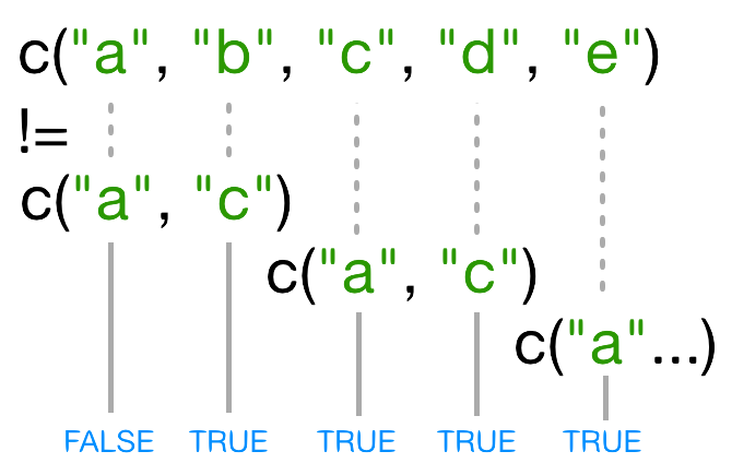
Subsetting Data
図の1
![Inequality testing](fig/06-rmd-inequality.1.png)
図の2
![Inequality testing: results of recycling](fig/06-rmd-inequality.2.png)
Control Flow
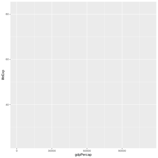
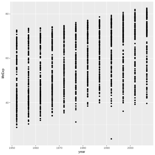
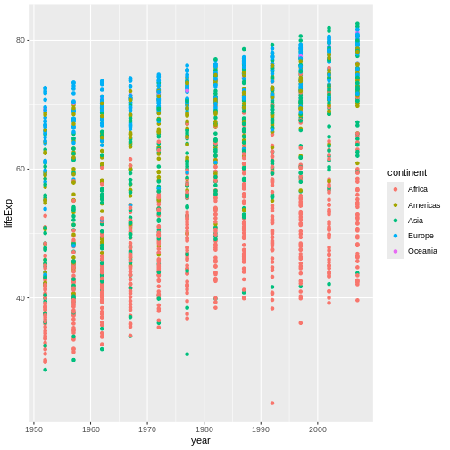
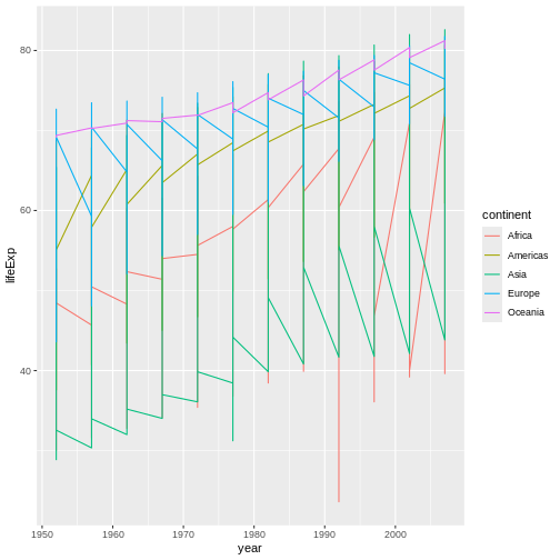
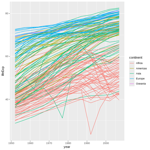
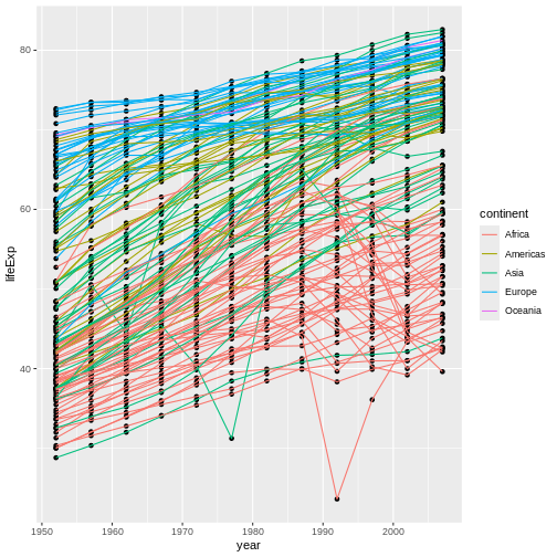
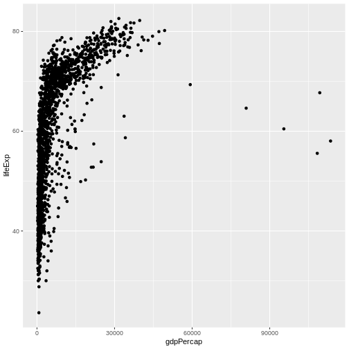
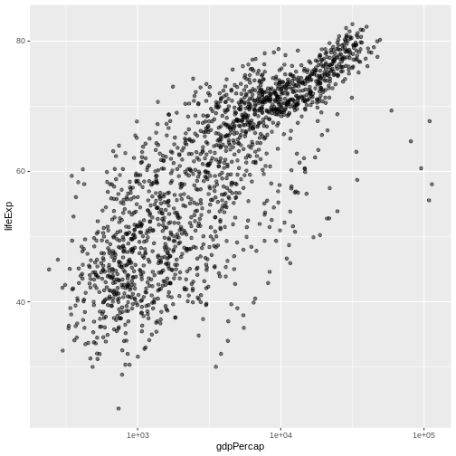
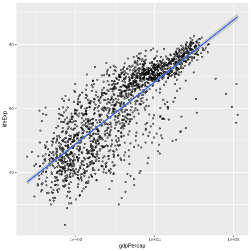
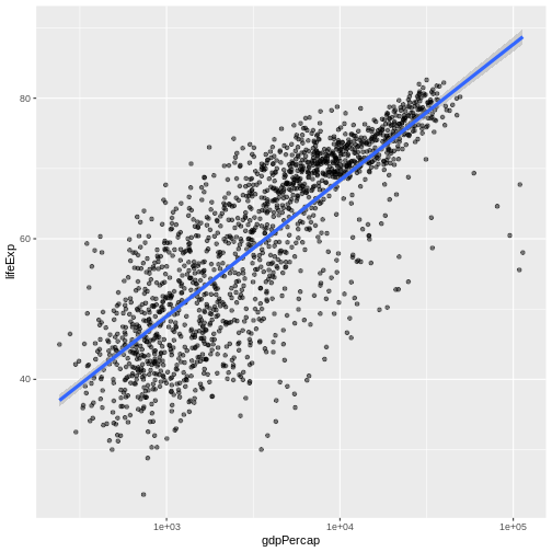
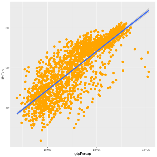
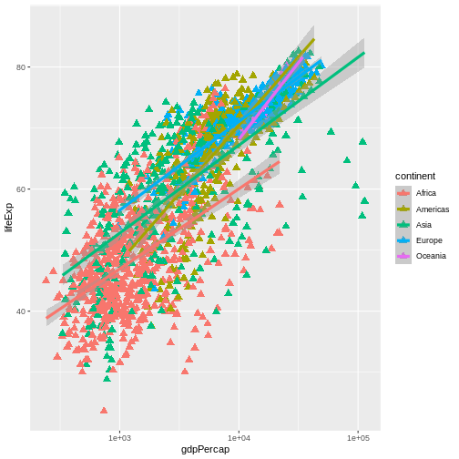
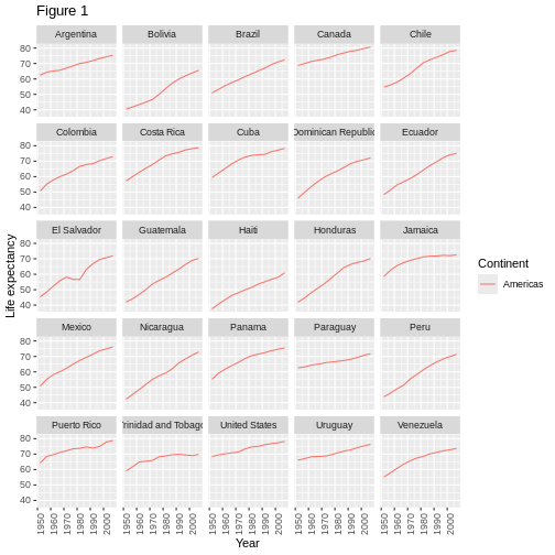
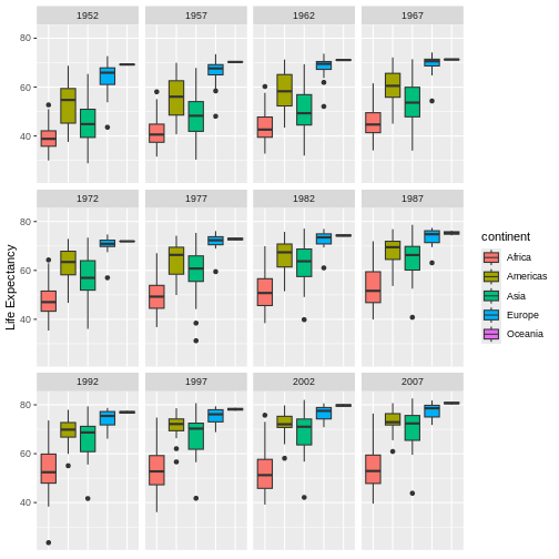
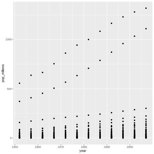
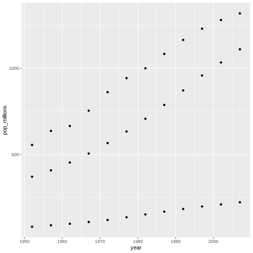
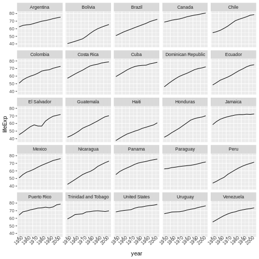
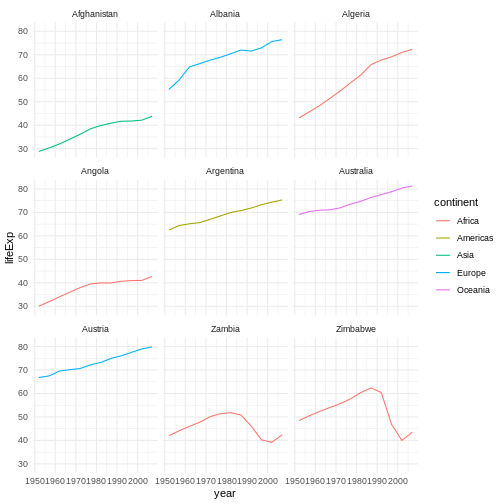
Creating Publication-Quality Graphics with ggplot2
図の1
![Blank plot, before adding any mapping aesthetics to ggplot().](fig/08-plot-ggplot2-rendered-blank-ggplot-1.png)
図の2
![Plotting area with axes for a scatter plot of life expectancy vs GDP, with no data points visible.](fig/08-plot-ggplot2-rendered-ggplot-with-aes-1.png)
図の3
![Scatter plot of life expectancy vs GDP per capita, now showing the data points.](fig/08-plot-ggplot2-rendered-lifeExp-vs-gdpPercap-scatter-1.png)
図の4
![Binned scatterplot of life expectancy versus year showing how life expectancy has increased over time](fig/08-plot-ggplot2-rendered-ch1-sol-1.png)
図の5
![Binned scatterplot of life expectancy vs year with color-coded continents showing value of 'aes' function](fig/08-plot-ggplot2-rendered-ch2-sol-1.png)
図の6
![](fig/08-plot-ggplot2-rendered-lifeExp-line-1.png)
図の7
![](fig/08-plot-ggplot2-rendered-lifeExp-line-by-1.png)
図の8
![](fig/08-plot-ggplot2-rendered-lifeExp-line-point-1.png)
図の9
![](fig/08-plot-ggplot2-rendered-lifeExp-layer-example-1-1.png)
図の10
![Scatter plot of life expectancy vs GDP per capita with a trend line summarising the relationship between variables. The plot illustrates the possibilities for styling visualisations in ggplot2 with data points enlarged, coloured orange, and displayed without transparency.](fig/08-plot-ggplot2-rendered-ch3-sol-1.png)
図の11
![](fig/08-plot-ggplot2-rendered-lifeExp-vs-gdpPercap-scatter3-1.png)
図の12
![Scatterplot of GDP vs life expectancy showing logarithmic x-axis data spread](fig/08-plot-ggplot2-rendered-axis-scale-1.png)
図の13
![Scatter plot of life expectancy vs GDP per capita with a blue trend line summarising the relationship between variables, and gray shaded area indicating 95% confidence intervals for that trend line.](fig/08-plot-ggplot2-rendered-lm-fit-1.png)
図の14
![Scatter plot of life expectancy vs GDP per capita with a trend line summarising the relationship between variables. The blue trend line is slightly thicker than in the previous figure.](fig/08-plot-ggplot2-rendered-lm-fit2-1.png)
図の15
![Scatter plot of life expectancy vs GDP per capita with a trend line summarising the relationship between variables. The plot illustrates the possibilities for styling visualisations in ggplot2 with data points enlarged, coloured orange, and displayed without transparency.](fig/08-plot-ggplot2-rendered-ch4a-sol-1.png)
図の16
![](fig/08-plot-ggplot2-rendered-ch4b-sol-1.png)
図の17
![](fig/08-plot-ggplot2-rendered-facet-1.png)
図の18
![](fig/08-plot-ggplot2-rendered-theme-1.png)
図の19
![](fig/08-plot-ggplot2-rendered-ch5-sol-1.png)
ベクトル化
図の1
![Scatter plot showing populations in the millions against the year for China, India, and Indonesia, countries are not labeled.](fig/09-vectorization-rendered-ch2-sol-1.png)
図の2
![Scatter plot showing populations in the millions against the year for China, India, and Indonesia, countries are not labeled.](fig/09-vectorization-rendered-ch2-sol-2.png)
Functions Explained
データの出力
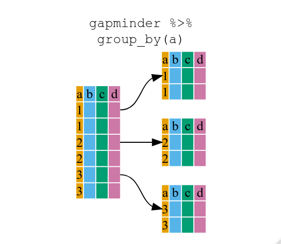
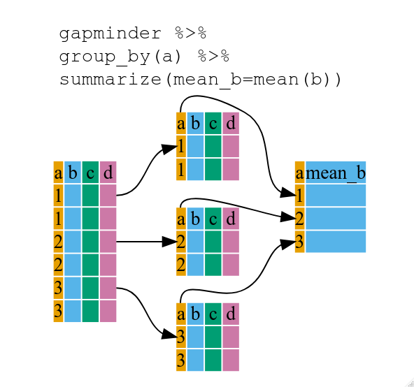
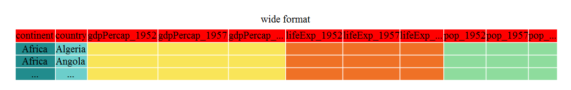
Data Frame Manipulation with dplyr
図の1
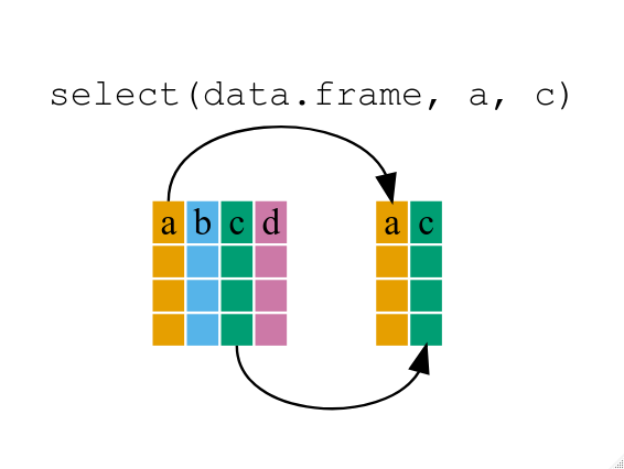
If we want to remove one column only from the
gapminder
data, for example, removing the continent
column.
図の2
![Diagram illustrating how the group by function oraganizes a data frame into groups](fig/13-dplyr-fig2.png)
図の3
![Diagram illustrating the use of group by and summarize together to create a new variable](fig/13-dplyr-fig3.png)
図の4
![](fig/12-dplyr-rendered-unnamed-chunk-27-1.png)
図の5
![](fig/12-dplyr-rendered-unnamed-chunk-28-1.png)
図の6
![](fig/12-dplyr-rendered-unnamed-chunk-29-1.png)
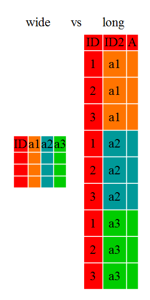
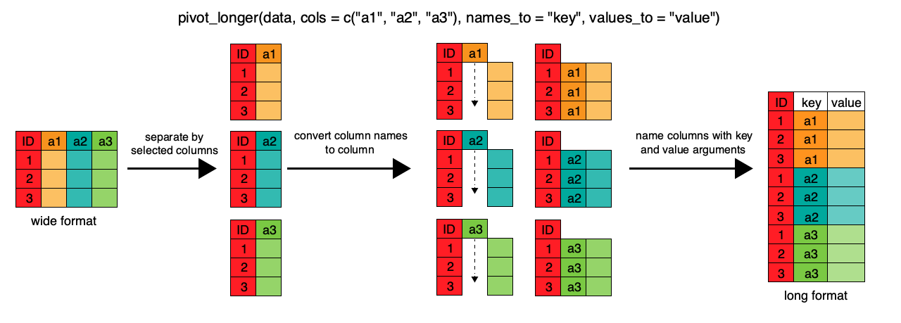
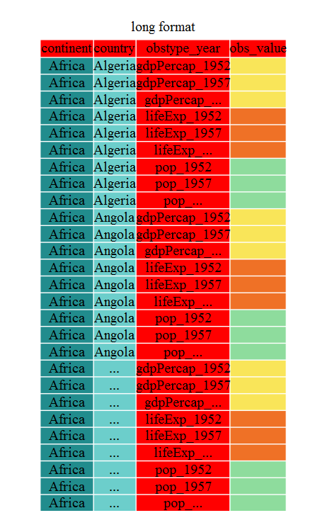
Data Frame Manipulation with tidyr
図の1
![Diagram illustrating the difference between a wide versus long layout of a data frame](fig/14-tidyr-fig1.png)
図の2
![Diagram illustrating the wide format of the gapminder data frame](fig/14-tidyr-fig2.png)
図の3
![Diagram illustrating how pivot longer reorganizes a data frame from a wide to long format](fig/14-tidyr-fig3.png)
図の4
![Diagram illustrating the long format of the gapminder data](fig/14-tidyr-fig4.png)
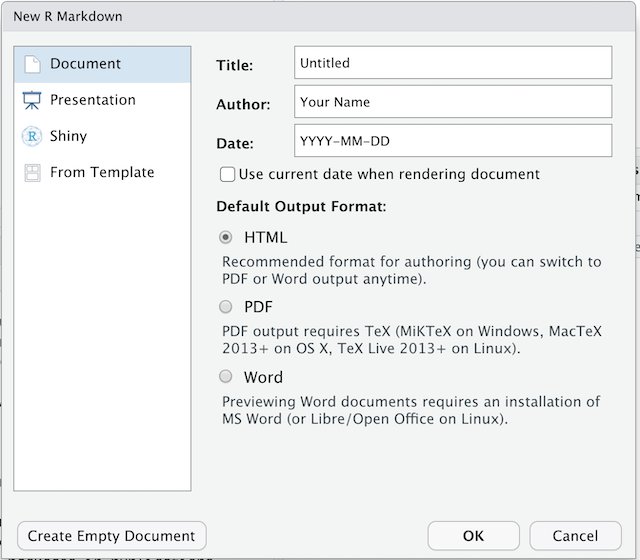
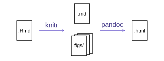
Producing Reports With knitr
図の1
![Screenshot of the New R Markdown file dialogue box in RStudio](fig/New_R_Markdown.png)
図の2
![](fig/14-knitr-markdown-rendered-rmd_to_html_fig-1.png)
図の3
RStudio versions 1.4 and later include visual markdown editing mode.
In visual editing mode, markdown expressions (like
**bold words**
) are transformed to the formatted appearance
(bold words) as you type. This mode also includes a
toolbar at the top with basic formatting buttons, similar to what you
might see in common word processing software programs. You can turn
visual editing on and off by pressing the
button in the top right corner of your R Markdown document.